During the semester long traineeship at Digital Society School I saw a need for and an opportunity for our team to create a consistent visual language that we could use to engage participants in our research.
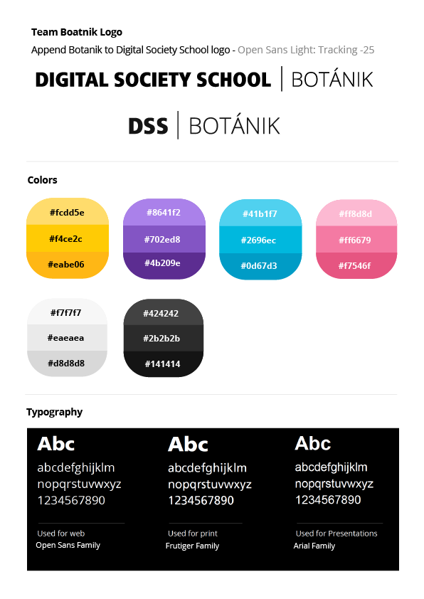
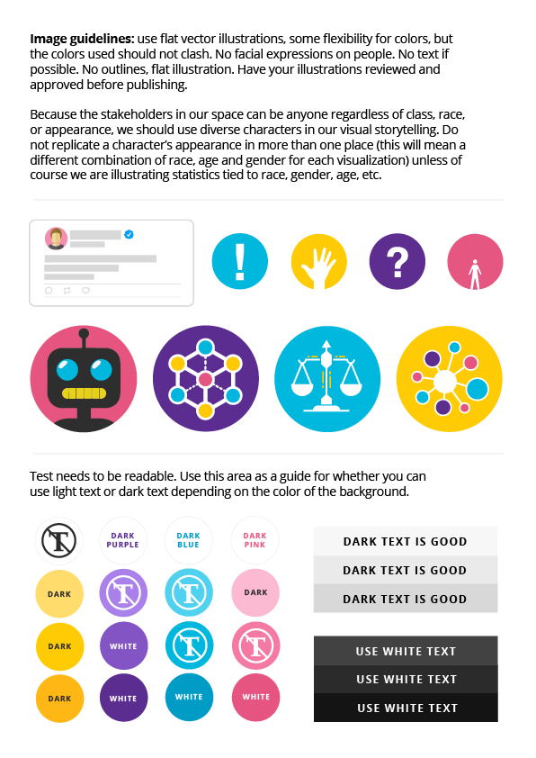
Branding our team, Botanik, was a fun challenge. Because our subject matter (online hate and abuse) could be sometimes dark and disturbing, and our solutions and research technical to the point of obscurity, I created a brand that is simple, bright and colorful, playful and approachable.
As part of the development of the brand I hosted a branding workshop that involved a presentation on the role that characterization plays in branding on organization, and how consistency is imperative to building trust and maintaining an ongoing conversation with an audience.
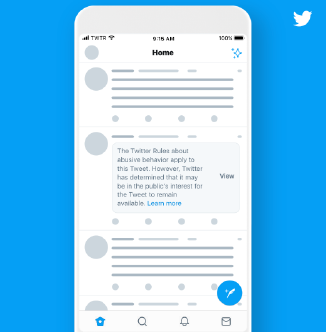
We used Twitter’s flat, minimal, and colorful branding as inspiration for getting started. Associating our project with Twitter visually utilizes familiarity with the visual elements that Twitter users might appreciate.
Established brand guidelines enabled our team to work independently with a reference for which colors, fonts, and what type of imagery to use in our presentations and other work. This added organization helped us to streamline our operation producing assets on tight deadlines throughout each the five three-week sprints.